

Many maps of our world are familiar enough that if we see one with a small difference, it looks “wrong” to us. Consider the map at the right, in which the North Pole is at the bottom and easterly points are to the left of westerly ones. Compared with the most common world maps, this is upside-down, though that’s mainly because world cartography in the modern era has been dominated by Europeans.
However, there’s no reason why we should put north at the “top” of the map, and plenty of reasons to consider drawing maps differently. Consider the map at right again: it’s based on the famous McArthur’s Universal Corrective Map of the World, first published in 1979 by the Australian Stuart McArthur. However, it’s just a common version of the world map turned “upside down” for the sake of putting Australia near the top of the page; it’s still a distorted and misleading map in most ways.
Flat maps of our round Earth are known as projections. While there are many projections, the best-known (at least by name) is probably the Mercator projection, which is also the basis for McArthur’s map. Mercator was designed for ease of use by shipboard navigators and projects Earth’s mostly spherical shape onto a cylinder. The result is that features closer to the poles, like Greenland and Antarctica, are bigger than Africa, while close to the equator things are relatively better-proportioned. The Mercator projection is noteworthy because latitude and longitude lines are all straight on the map, which means if you look at any small patch of the map, everything is relatively correct. I think that factor accounts for the longevity of the Mercator projection, despite its obvious flaws.
However, no map of the world can ever be perfect for one simple reason: it’s literally impossible to reproduce the surface of a sphere onto a flat plane without distortion. That’s true even if the sphere is featureless and smooth — no matter what you do, there will always be at least some gap, overlap, or stretching to make things match up. To see this, consider the best we can possibly do: an impractical map called the stereographic projection, derived from projective geometry.
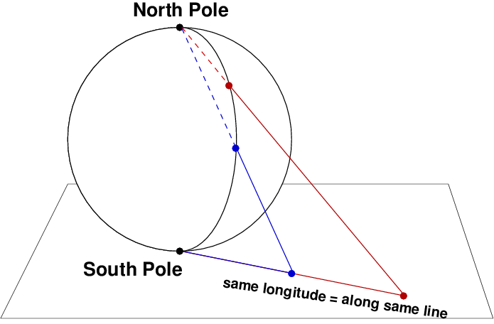
In the stereographic projection, you rest Earth (or whatever spherical object you’re working with) on an imaginary flat surface that will serve as your map. For each point on the globe, you draw a line connecting it to the North Pole and extend it until it reaches the map. All points on the same longitude line will lie along the same line on the map, and latitude lines will be circles. However, one point won’t be include on the map: the North Pole itself, since you can’t draw a unique line from the North Pole to itself that connects with the plane. In a mathematical sense, the North Pole lies at infinity in all directions on this map, something that’s perfectly OK in pure math (and I hope to return to that topic, as it relates to the geometry of spacetime and the behavior of elementary particles) but impractical for us.
As it turns out, the stereographic projection is the best we can do: any flat map will have at least one point that doesn’t fit. The Mercator projection has two: both poles are represented by lines rather than points, and that’s why Antarctica ends up looking as big as all the other landmasses combined. Even the simple coordinate system we use for navigation breaks down at the poles: while they each correspond to a unique latitude, note that on a globe, all longitude lines converge there, meaning you don’t have a defined longitude while standing at the South Pole.
So what if we break away from this kind of projection entirely? The brilliant eccentric Buckminster Fuller did just that in a 1943 article in Life magazine with his Dymaxion map. (Dymaxion is a word Fuller made up and used for many of his creations, so it has no particular geometric meaning.) Instead of trying to map latitude and longitude lines as straight as possible, or keep the map as close to a rectangular shape as possible, he projected the surface of Earth onto the faces of a geometric object.
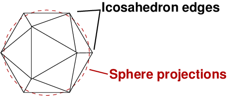
The simplest Dymaxion map projects Earth’s surface onto an icosahedron, which is a geometrical shape with 20 triangular sides of equal areas. (This is familiar to tabletop gamers as a 20-sided die.) Since the relative amount of projection from a curved surface to a flat one is less than in the Mercator and stereographic maps, there’s a lot less distortion.
![One version of the Dymaxion map, which broke away from the strict icosahedral structure, while keeping the basic idea. [Credit: Buckminster Fuller Institute]](https://galileospendulum.org/wp-content/uploads/2013/09/dymaxmap2.jpg?w=1024&h=381)
Earth isn’t a perfect sphere, of course, but it’s mostly so. As such, it has only two special points from a geometrical standpoint: the poles, which mark the axis of rotation. In that sense, placing the North and/or South Poles at a special place on a map makes sense, but we don’t have to do it that way. In imperial China, south was the sacred direction, and chariots were constructed with devices that always pointed that way — there’s nothing inherently special about north. Maybe by breaking the habit of putting north at the top, we can at least rid ourselves of the notion that “north is up“.
The Dymaxion map, of course, is only one such way to free ourselves from the tyranny of bad map projections. I think it’s telling that Fuller was an architect (among other things), and his map feels like an architect’s solution to the problem. It’s a simple, elegant, geometrical idea that helps us see our planet home in a new way.

One response to “Of maps and math and Buckminster Fuller”
[…] Of maps and math and Buckminster Fuller (Galileo’s Pendulum): Mapmaking will never be perfect because there’s no way to create a flat representation of the curved surface of Earth without some distortions. This post goes a little into the math of projection, the art of converting positions on a globe onto a flat map, and how the eccentric utopian architect Buckminster Fuller tried to solve the problem. The result was his wonderful Dymaxion map, which as a physicist I’m very fond of. […]